
Assignment: "In ten years’ time, more people will be living in cities than ever before in human history. If we want to live in a sustainable and inclusive world, we must commit to promoting the development of sustainable and inclusive cities.." Produce a single image to illustrate Urban poverty in your community to be published in Oxfam publications. Please refer to the example Terms of Reference to get information on how Oxfam works with photography and consult their website for corporate image style. The question of subject dignity and ethical photographic practice should be a major factor in the way you go about this assignment.
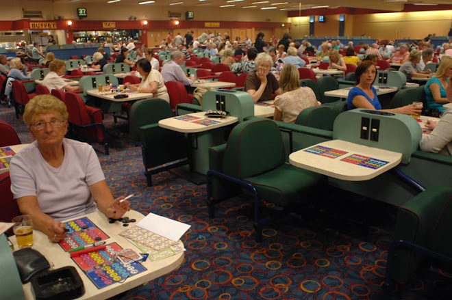
This time it’s urban poverty. Not too difficult you would think, not in northern England anyway.
Crucially though with this week’s assignment there was a subtle twist. It had to be a photograph in keeping with those used by Oxfam. Quite a few people on the course missed this.
Oxfam’s images, apart from being sparse in the area of UK poverty (there’s plenty abroad), lack grit and realism. Instead they try and show the positive side of its charitable work with images very pristine, sort of Getty-fied, Americanised, sanitised.
My image was positive (reasonably) but lacked any impact or ‘wow’ factor (but I do think it was Oxfam-friendly).
One other point of note is the comment system we use on the course. We have to caption our pictures, like you would as an agency, then leave an open explanation. Four, five or possibly twelve of our fellow students then leave their own critique of my image in relation to the brief. And I must do a final, concluding comment.
Thing is, some students are captioning their photographs with what I consider lengthy and irrelevant personal information. They are then doing the same with their opening comment.
A lot of the conclusions are also short story-esque, though admittedly they do stick to relevant analysis more than the first comments. The problem for me is that I’d like to have a life outside of this course and having 40-odd monologue style comments to read is too much. There’s just too much waffle.
It’s impossible to read everyone of them, and I think this detracts from the course because students will end up missing the good points which will improve their understanding of photography.
I could take this up with the ultra-friendly Mr Beesley, or I could just get him to read my blog. Problem is, he’d have to wade through too much waffle to get to the point.
This is the point – this particular blog has gone on way to long.


No comments:
Post a Comment