Saturday, March 31, 2007

Assignment 7


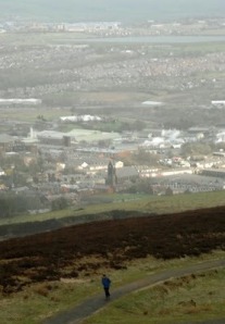
Assignment: Produce a single image on the subject of Cast Away. Your picture should be designed to give a sense of tranquillity and peace away from the hustle of city life. The picture is aimed at Conde Nast Traveller magazine and should be accompanied by a caption that will be understood by a broad international readership.

There was a heated debate in our seminar this week about the type of image required for this assignment and whether a less obvious image would work.

By ‘less obvious’ I mean a photograph which fails to meet the brief, would never be used by a travel magazine editor and which is supposed to make the viewer think deeply about some kind of suggested hidden meaning. Can you guess which side of the fence I was sitting on?

There was a feeling of hysteria in the class as several otherwise normal people decided a magazine is needed that uses abstract imagery to suggest a holiday landscape where the reader must use their brains to think. Suddenly everyone’s a magazine editor.

Thinking of doing this course? Prepare yourself to be smacked around the face by intellectualism.

If such a magazine did exist it wouldn’t sell many copies. It would fold very quickly. That’s the harsh reality. It was a good, polarising discussion though, even if it was poppycock.

Anyhow, my image for this assignment attempted to show a man escaping city life in a quite literal way. The weather form the top of Sunnyhurst Tower in Darwen, Lancashire, meant that this photograph would never make it on to the pages to Conde Nast Traveller. But neither would Darwen, Lancashire.

Dyer Traits

A bit about Geoff Dyer (and it’s a bit long, so hang on in there).

Geoff Dyer is a kind of theorist. He theorises on photographs. This is my theory on him.

Total boll ocks. Nice fella like, but his ideas were built on pointless theory and scandalous assumption.

He gave a nice lecture. If you like hats. Or jazz. Or white fences. He didn’t take his coat off either. The whole afternoon was strange,

I know it’s difficult to believe that a serious theorist could keep a straight face for an hour as he talked about his analysis of 1920s photography through images with hats in them, but Geoff managed it.

I have to admit I sat there in disbelief for most of the talk. Can you really have an intellectual, photography-based discussion on hats? Evidently, yes.

In my opinion Geoff, who does not take photographs himself, used a great deal of unfounded interpretation of photographs, garnished with a smattering of rhetoric.

It all came to a head when he spoke about one photographer who had taken a picture of a white fence. Geoff claimed the photographer had obviously referenced some previous images of white fences in some cultural tribute. He even wrote in his book.

But the photographer told Geoff this was, in fact, clap trap. He liked the white fence, he took a photo of it.

If ever there was proof needed that over analysis yields pointless theories, this was it. Geoff still writes his books.

He listened a lot in the lecture. So intently was he listening, in fact, that I am convinced we gave him the idea for his next book. ‘If brown is the new black,’ one student asked, ‘what is the new hat?’ Now there’s a Geoff Dyer lecture to miss next year.

Good luck to him, he probably earned more money for that lecture than I take home in a week. And a few of my fellow students stuck up for him. But is he really contributing to the discussion? He is, if you like pointless discussion. Well if the hat fits...

NOTE: The worrying thing is this: I would never have taken a photograph of a white fence but might be tempted to now after Geoff’s lecture. I have been made aware of pointless white fences in photography. My mind has been poisoned. Geoff Dyer has poisoned my mind.

Thursday, March 22, 2007

The nightmare that turned into a bad dream

There are those on this course, not least the lecturers, who are not happy with its organisation.

The Virtual Learning Environment for our photography MA is quite a funky little thing if you ignore all the broken links. You get all your assignment information, reading guides and timetables in one place, plus all the news from the students studying in China. And that’s part of the problem.

The course is run by a British man called Dave Clarke who lives in Dalian where the course is run simultaneously with Bolton’s. Why is that? Well, I’ve only heard in whispers that it’s because Clark likes living there. Other than that, there’s no reason for the link.

Problem is there has been several communication problems. This culminated in a rather heated debate in Bolton’s main lecture theatre on the Chadwick Campus last Thursday (March 15) because our most recent assignment, number 7, was totally cocked-up. There were two different tasks (see assignment 7 notes).

It has become increasingly obvious over recent weeks that both Ian Beesley and his assistant Terry Speake are very disillusioned with the management issues between here and Dalian.

They have tried to hide it from us, Ian even advising some students against emailing Clarke directly, but when half the seminar is spent ironing out confusion over course direction, frustrations come to the fore.

One of the students even revealed he had considered turning down the invitation to join the course because of the feedback he got from other academics within the industry. ‘It’s getting better,’ said Ian, ‘last year was a nightmare, now it’s just a bad dream.’

Personally I couldn’t give a toss what problems they’re having between here and China. There are a few little problems but the course is run well in Bolton, perhaps it should be run entirely from Bolton. However, if the students in Bolton is being told or emailed one thing, while the VLE postings say something entirely different it is not good. The students carry out the wrong assignments, the lectures look clueless.

I feel Ian is desperate not to antagonise Clarke, but how long he will diplomatically put up with these kinds of problems as a self-confessed tell-it-like-it-is man I don’t know.

Should I be writing this now? Well, as a firm believer that blogs are nothing more than never read diaries, I don’t think it’ll make any difference.

Nobody knows about this bog on my course. It is written as a diary which could possibly be read by a prospective student on the course. That’s the only value I see in it; showing what goes on. It could give them something to talk about when they meet Ian for their application interview. One thing I will say is I’m loving the course, I’m sure others will too.

If Dave Clarke should read this, I don’t think he’ll have too much cause for complaint.* I’m sure he’s aware of the complaints already. We’ll see if I get pulled up about it.

If I do I’ll say: ‘Freedom of speech, tell it like it is’. Much like Ian Beesley.

*If you do complain, please me reference using the Harvard citation system.

Wednesday, March 21, 2007

The nightmare that turned into a bad dream

There are those on this course, not least the lecturers, who are not happy with its organisation.

The Virtual Learning Environment for our photography MA is quite a funky little thing if you ignore all the broken links. You get all your assignment information, reading guides and timetables in one place, plus all the news from the students studying in China. And that’s part of the problem.

The course is run by a British man called Dave Clarke who lives in Dalian where the course is run simultaneously with Bolton’s. Why is that? Well, I’ve only heard in whispers that it’s because Clark likes living there. Other than that, there’s no reason for the link.

Problem is there has been several communication problems. This culminated in a rather heated debate in Bolton’s main lecture theatre on the Chadwick Campus last Thursday (March 15) because our most recent assignment, number 7, was totally cocked-up. There were two different tasks (see assignment 7 notes).

It has become increasingly obvious over recent weeks that both Ian Beesley and his assistant Terry Speake are very disillusioned with the management issues between here and Dalian.

They have tried to hide it from us, Ian even advising some students against emailing Clarke directly, but when half the seminar is spent ironing out confusion over course direction, frustrations come to the fore.

One of the students even revealed he had considered turning down the invitation to join the course because of the feedback he got from other academics within the industry. ‘It’s getting better,’ said Ian, ‘last year was a nightmare, now it’s just a bad dream.’

Personally I couldn’t give a toss what problems they’re having between here and China. There are a few little problems but the course is run well in Bolton, perhaps it should be run entirely from Bolton. However, if the students in Bolton is being told or emailed one thing, while the VLE postings say something entirely different it is not good. The students carry out the wrong assignments, the lectures look clueless.

I feel Ian is desperate not to antagonise Clarke, but how long he will diplomatically put up with these kinds of problems as a self-confessed tell-it-like-it-is man I don’t know.

Should I be writing this now? Well, as a firm believer that blogs are nothing more than never read diaries, I don’t think it’ll make any difference.

Nobody knows about this bog on my course. It is written as a diary which could possibly be read by a prospective student on the course. That’s the only value I see in it; showing what goes on. It could give them something to talk about when they meet Ian for their application interview. One thing I will say is I’m loving the course, I’m sure others will too.

If Dave Clarke should read this, I don’t think he’ll have too much cause for complaint.* I’m sure he’s aware of the complaints already. We’ll see if I get pulled up about it.

If I do I’ll say: ‘Freedom of speech, tell it like it is’. Much like Ian Beesley.

*If you do complain, please me reference using the Harvard citation system.

Week 6 assignment


We had the choice of two assignments this week, though that wasn’t the plan of the lectures (more of that later). While the actual assignment was the same (below) the outline brief was totally different on email from the one on the VLE.

Assignment: Produce a single image that documents the changing culture of your community for National Geographic magazine. Study the motivations for the National Geographic All roads project at www.nationalgeographic.com/allroads/photography.html and the wealth of information on National Geographic photography at www.nationalgeographic.com/photography/. This should inform your composition and caption

It took a while for the penny to drop with this assignment, especially when I was reading the first brief. I couldn’t think how I could apply changing culture to my locality (Preston in Lancashire). What I came up with is more of a national culture, though I did attempt to excuse the picture with the caption explaining the kebab shop was part or the city’s student area, a huge boom for the area over the last five years.

I quite like the image though it is not bold and bright enough for National Geographic magazine, for which I am proud to say I am a subscriber. This information is not needed, but it all helps to paint a picture of myself.

I digress, the idea of taking a photograph in a kebab shop only came to me on the Tuesday (our deadline is 4pm, Thursday) so I had two nights to get my picture. Both nights I was at work until around 11pm, so it was straight into Preston from Fulwood.

Unfortunately, Tuesday and Wednesday nights are not very busy in Preston. This is not the kebab shop I wanted to photograph but was the only one to have customers in it. I was using my preferred wide-angled lens. This is a subject I would happily return to in more depth, even with the risk of having my camera smashed or stolen

Tuesday, March 20, 2007

Very Little Elp

A major part of the course is the comments we make on other people’s pictures every week.

We were told at the outset not to criticise photographs on technical issues and not to get into a comment spat – commenting on comments.

It took a while for me to get my head around the technical issues. It is very difficult to comment on a photograph without mentioning technicalities. I think I got there in the end.

As for commenting on comments, apparently there was a physical punch up in class last year between two students who had disliked or disagreed with each others comments.

It’s easy to see how. I noticed early on how one or two people were leaving comments above what I would call the acceptable level or criticism. Two students in particular have been quite rude on other people’s photographs.

Now I’m not easily offended or over-sensitive, but some of the comments I have read have left me stunned. One guy accused people of being subconsciously prejudice because they criticised his migrant workers photograph. Other examples include:

The picture of three young Asian girls working in Britain, one comment read: ‘they look a little tarty. The one on the left is coyly massaging the tree trunk; the middle one looks like a juvenile delinquent; and the last one has a distinctly post-coital gaze.’

To be fair to this comment maker (above) it was the first week and she has not made similar comments since. Others however (below) have persistently gone for the jugular.

Of a picture of an old photo, ‘There is little I can say because it doesn't really meet the brief… You haven't even done the IPTC data properly. I think it is personally interesting for you, but as for the other MA students I don't think there is much we can learn from this photograph. By sticking more closely to the brief we can all help each other consolidate our knowledge through the appraisals we do each week. Otherwise you are just wasting our time as well as your own.’

Of his own picture of a somewhat bland skyline: ‘Some useful additional comments (thanks for these) that steered me to thoughts I hadn't considered at the time. Equally, a couple of rather dull and pointless comments, simply regurgitating what I've already said; their loss of opportunity to practise their analytical skills.’

That’s gratitude for you.

We have to leave several comments each week on eight different assignments. When it was pointed out to Ian Beesley and Terry Speake that some students had over-stepped the line it was obvious that the pair of them hadn’t read any comments. Ian said that the comments, which are to form an assessed journal I our first term, would be looked at after the eight weeks. If a student had over-stepped the line, he would be spoken to.

That’s a bit late as far as I’m concerned. We should be getting guidance after week one and week two to make sure that we’re on the right track. Telling us we’ve got it wrong after it’s all done is a bit negligent on their behalf.

I can only pray that I’m around when this year’s punch-up takes place.

Week 5 assignment


Assignment: The assignment this week requires you to produce a single image that represents fragile earth. The image is requested by a client of Panos Pictures for a magazine feature on the global environment. The article is designed to put pressure on all countries to re-evaluate their environmental policies in a move to improve the world in which we live. Panos pictures has gained a strong reputation for tackling social issues around the world through strongly aestheticised images. The composition and quality of your images are important to the success of this assignment so make sure you spend time looking through some of the Panos photographers featured on their website.

I used the parents one week, now I’ve used the kid. But the trump card was the fisheye lens.

One of the things I’ve found tough on this course is the depth of analysis. Maybe I’m to shallow – or too thick - but I can’t stand the critical evaluation. It often goes to a level which is far beyond what a picture deserves. It gets to a point where the analysis is effectively made-up or assumed, in my opinion.

When it comes to dreaming up picture ideas I am much more one-dimensional, more literal.

So. fragile becomes a rounded horizon courtesy of my fisheye lens and a earth is an isolated baby, seen here at Formby Point near Southport. The fact that Teddy was crying was a bonus.

What you can’t see here is me trying to keep the dogs out of the frame with one hand while trying to take the photograph with the other. The dogs, of course, are a trump card I’ve yet to play.

Week 4 assignment


Assignment: This week you are not required to take a picture but rather train someone else in basic photography to complete the assignment for you. The brief is simply to provide "a unique insight" through participatory photography. Try and find someone who can tell a story from a different angle. For example a child's first day at cub scouts, a policeman on a drugs raid, a homeless man surviving a night of rain, the list is endless. Please remember you are not being assessed on the final image but your analysis of the process and a deconstruction of the image.

Time to rope in the parents for this one. I worried if it is was a bit of a cop-out getting mam and dad involved.

But I thought the idea I had was a valid one, the pictures I asked my mam to take were of my dad in situations that I have not really photographed. It felt right. I decided to go with it. My dad works in his double garage at home building what they call control panels, complicated push-button metal boxes which drive heavy machinery.

I told my mam what to do, she did it. It’s easy this participatory photography. The pictures – and this one in particular – were exactly what I wanted. As I might have said before I had previously thought of this type of photography as not worth consideration. But I see value I it now after the input of our course leader Ian Beesley.

Monday, March 19, 2007

Down The Essay Way

It's been a difficult few weeks on this MA course, mostly because of the dreaded essay.

Now, I'm not one to moan and I know every student has their own reason why the essay is so difficult to write, but it was a bit of nightmare.

That's not to say I've finished it - I've only done the draft and it needs some work done yet.

No, my biggest problem was the words, or wordage as it's known in essay writing circles (why use a simple word when an longer, more complex and abstract word will do perfectly well instead?).

This essay - I chose the title 'Reuters' picture editors, photographers or PR's - who is responsible for the photographic manipulation of Adnan Hajj?' - is 2,000. Not a lot. Except that if you're an incredibly highly-skilled journalist used to cutting down copy and getting the point across with as few words as possible.

Quite frankly, I could have got my point across in 200 short words, not these long drawn-out sentences which I regard as total bollocks. You would get the gist of it anyway.

NOTE: My completed essay will not be published on this blog. Copies will be available on request for GBP9.99.