Monday, December 24, 2007

Selling the book, or not selling the book

Would you buy a book on smoking?

Oh no you wouldn't! Oh yes we would!

Well it is pantomime season, after all.

This was the argument we had toward the end of the presentation of my book to my fellow students. I adamantly believe that the dirty subject matter of my book is too undesirable for someone to want to own. No one would by it (should it ever become available).

I base this opinion on two things: Smoking is perceived as being 'dirty', even by smokers, and photography books don't sell well at the best of times, so on the rare when someone does by one they will plump for a beautiful landscape or architectural book.

But my colleagues, and even my lecturers, disagreed.

The short debate which followed said I was being to dismissive of photography.

I do think sometimes these lovely people get a bit carried away with the ideology of photography. The conversation reminded me a group discussion I think I mentioned before where a few students got a bit ideological over what a glossy travel magazine should publish (though-provoking abstract images over chocolate box landscapes).

If a magazine has made it success on stunning landscape images, it is not going to use abstract travel snaps instead, however well-intentioned they are. What is superior and what is wanted by a commissioning editor are two different things. And I think the same argument applies to people buying books. You have to give them what they want, not what you want to give them.

There are dozens of amazing documentary photographers out there producing great, award-winning work. The problem is, a lot of these photographic essays are winning awards despite never having been published. There just isn't a market for them in the press or as books.

Every documentary photographer I have ever spoken to or interviewed has to carry out commercial work to earn a living, with their documentary passion nothing more than the unpaid bit extra.

I'm a big believer in thought-provoking photography, I just don't think it sells.

Flashes to Ashes - book design


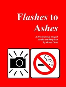
Smoking is brash, dirty and fast. And so is my book. I went A4-ish portrait size to make the most of my portraits (at full bleed). I used only one photograph per page (sometimes one photograph with no picture on the opposite page). And I used a bright red cover with a no smoking and a camera symbol to echo the book's title Flashes to Ashes.

A photo book can be a beautiful object, and indeed there were some beautiful, huge books produced by some of the students on my course. You can sit down with a treasured book and slowly take in every photograph and read every piece of text. But this is not what my documentary subject matter was about.

The photographs themselves were fast, mostly with flash and in-our-face. That's how I've tried to design the book too.

I see this book as something you would flick through and toss away, so the text is minimal. In fact, I've done everything I can to make it a fast flick The photo captions are very brief and, on some pages, I have used a huge headline-style font to tell the story and help push the viewer to turn the page as fast as possible.

It makes for a quick, flowing book. But I do believe the viewer will look at every photograph, which is not true if your book has hundreds of photos crammed onto loads of pages.

I think I might even re-print it on a smaller scale on comic boo paper. It's lighter and more trashy, like a cigarette.

PDF nightmares

I decided very early on to use lulu.com to publish my book. If you ignore the photobook section and use one of the general book sizes, you can effectively upload your book with any design you want - if you convert it to a pdf.

And here lies the problem. Converting your book to a pdf is more complicated than you ever dare imagine.

So, for the reader's awareness and to remind myself, here is a list of problems I encountered.

1. You have to change the document size through the Adobe pdf icon in the printer folder because if you do it through page size it goes wrong when the pdf is converted.
2. You have to embed all the fonts before you convert to a pdf (but you actually have to print to postscript first before your process the file through Adobe Distiller.
3. The most common fonts do not embed and have to be done separately through another process which involves dropping the file into Adobe Distiller. In Distiller you need a new printer-set up.
4. In the new printer set-up there is a glitch in the system that can see your page measurements being changed from inches to feet - resulting in a 7ft wide 40gb document being converted. This problem was almost insurmountable.
5. After converting to pdf, your front and back cover file includes two blank pages and is useless. In the end, I had to import the pages separately as jpeg's to lulu - but this restricts what you do with the spine (i.e. you can't change its colour).
It is very complicated and, only a week or so after doing it (dozens of times) my mind is already frazzled. There is a link on the lulu FAQ section to a tutorial, but this is not as straightforward as it should be.

Next time I do it, I will make detailed notes. Then I can blog it all again.

Should they stay or should they go?


For my next meeting with Pieter van der Houwen (PVDH) at the end of November I showed him 100-odd photographs. The main subject of debate was my Shisha café smoking photographs.

He said they should be dumped from the book. I'm open-minded and willing to listen. And so, it appears is Pieter. Because when he asked one of my fellow student Rob Colin Thomas (I never did ask him why he uses Colin in his name) what he thought about it, RCT said: Keep them in.

Then PVDH said: Yes, keep them in. He changed his mind! In a matter of seconds!

This, to me, sums up the subjectivity of photography. You glance at a photo and make an instant judgement. But sometimes your judgement reflects how you're feeling at the time. And feelings change. Often.

Now I'm not knocking PVDH. A nicer man you could not wish to meet. He's got lot to say and is worth listening to. It's just that such changeable, subjective views should not necessarily be taken as gospel.

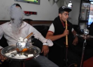
Still, I came away from PVDH with some new ideas about the layout and the flow of my book. And the Shisha pictures will be included, mainly because smoking and these Asian-run Shisha café's are an important part of British culture.

PVDH also recommended I dump the office workers smoking photographs. So from now on, this project is all about social smoking. I think he said that because the office worker shots were quite boring. I agree.

Better late then never

When you start these blogs, it's with the best intentions. Updates every week, informative chat.

I didn't do too badly this year, until the work started to get on top of me. A horrendously complicated book project and a stupidly theoretical 5,000 word essay meant no time for thinking, or writing, or reading (my huge pile of unread magazines are testament to that.

Still, four days ago the toil ended when, on Thursday, December 19, 2007 my photography MA course at Bolton University ended. I shall now endeavor to catch up with what went on over the next few blogs.

Sunday, December 23, 2007

Back in Blackpool


I'd just like to make a point of mentioning my last night taking smoking pictures.

It was one week before November 5, when Blackpool's famous illuminations go dark.

I wanted to get some street light shots before I hit the pubs - but it was raining and very windy and I ended up wasting a couple of hours. Nevermind.

On Pieter van der Houwen's advice I was looking to get more portraits. I did get a couple.

But I'd like to pay my respects to the lass with the orange hands from Yorkshire (Barnsley or Doncaster - I can't remember. I bumped into he outside the chippy. And then there was the shoeless bunny girl with the panda eyes sitting on the step outside the famous Tower Lounge. 'What? You wan't to take a photo of me looking like this?' she asked, as sweat dripped down the side of her smudge-make-up face.

I don't need to answer that question, do I?

Better late then never

When you start these blogs, it's with the best intentions. Updates every week, informative chat.

I didn't do too badly this year, until the work started to get on top of me. A horrendously complicated book project and a stupidly theoretical 5,000 word essay meant no time for thinking, or writing, or reading (my huge pile of unread magazines are testament to that.

Still, four days ago the toil ended when, on Thursday, December 19, 2007 my photography MA course at Bolton University ended. I shall now endeavor to catch up with what went on over the next few blogs.

Monday, November 05, 2007

Houwen Do You Do!

I’ve had a frustrating time trying to get office workers to allow me to photograph them smoking outside their buildings.

Without the lubrication of alcohol, it seems people are too ashamed to be pictured feeding their nasty little habit. That’s the impression I get anyway.

Things got so bad last week while trawling the streets of Bolton that I ended up photographing a woman who was rigid with fear when she set eyes on my camera and approaching some Chavs* in a backstreet who threatened to sue me if I put the picture in the paper. Ever tried to tell a Chav that, no, he couldn’t sue me if I used his picture in a newspaper? It’s better just to walk away.

As for the woman… well, at least she said ‘yes’. Photographing smokers at work has been a far from satisfying experience.

But at Bolton University we had renowned photographer and documentary film maker Pieter van der Houwen fly in from Holland for a talk and to asses our project pictures.

Houwen, who produced the documentary Thru Dutch Eyes (well worth a view), said he liked some of my portraits, but suggested I forget about trying to represent all smokers in my project.

So, taking his advice on board, I have decided to concentrate on the social side of smoking for my project, which I now see as a documentation of the working classes as much as smoking (or at least the working classes who smoke).

Enthused by Houwen, I took to the streets of Blackpool again for four hours of dash and grab photography.

Now I have the laborious task of doing a first edit of my photographs, which I will present to Houwen on his next visit to Bolton later in November.

* Chav is a phrase we use here in Britain to describe hooded-top wearing, slightly aggressive teenagers who vandalise and terrorise. They demand respect while failing to give it, fuel themselves on cheap booze and drugs and collect ASBOs.

Thursday, October 04, 2007

Oh Vienna.. and Austria and other photographic experiences


So there I was, after three incredible days of travel, food and booze, slumped in a chair in the hotel foyer.
It was 1.30 in the afternoon, I had been drinking until seven that morning. I still felt delerious and exhausted.
My eyes were closed, as my Mp3 player pumped out songs into my sore head.
When I opened them momentarily, she was there. Sitting at the next table across from me. Waving and smiling. Blonde hair, short dress, thick make-up. I was about to get propositioned by a high-class prostitute.*
Very quickly Andrea told me that she was a psychologist, health worker, actress and singer, and possibly a few other things I can't remember. She said she owned one-ninth of a huge potato farm in Austria and had slept with two men the previous day, one of which was her best-ever lover.
I promise you I am not making any of this up.
She also quizzed me about whether I thought the two pensioners sitting near us were feeling horny, if I liked 'f***ing' (she did) and allowed me try on her blonde wig.
By the time Robert, the little Irishman, joined me, she was roaring with laughter as she sang seductive love songs to us.
It goes on… when I told her what I did for a living she asked me to photograph her as she smoked (an added bonus) and also proceeded to stand up, lift her leg onto the chair and say 'is this a bit sexy?' He skirt also had a nasty habit of rolling up to the top of her legs as she sat. We made our excuses and left.
Abiding memory of Austria, probably not, but meeting this woman is certainly not an encounter I'll forget in a hurry.
My four days in Klagenfurt and Vienna was as good a trip as I've ever had. The scenery, the architecture, the hospitality, the nightlife. First class all the way.
Now, obviously, this was a press trip (I was working for the Daily Star) and the Austrian tourist employees could not do enough to make sure we had the perfect trip, from the best restaurants and five star hotels to the use of the Rapid Vienna team coach and the dutiful company of the tour guides as we drank until it was morning. The bike ride was something special, too.
But the country bowled me over in spite of that. It was the scenery and clean air in Klagenfurt, it was the awesome architecture of Vienna (by far the most beautiful European city I have visited so far). It was amazing.
NOTE: I would like to apologise to Andrea if my assumption is incorrect and she is not a prostitute (but I think she was).

Manchester United 1 - 0 Sunderland


I'm in the Daily Star offices in Broughton, near Preston, on Saturday as Louis Saha scored a 72nd-minute goal at Old Trafford 35 miles away.
There was never going to be any coming back from that for Sunderland. Ten-minutes before the end, at about 7pm, I was told I could leave for the night. So off I raced to Manchester for what should be my last summer night out taking photographs of people smoking.
Forty-odd minutes later I was on Oldham Street. I had about half an hour of light (ISO 500) before the flash came out.
A Manchester United fan walked past me wrestling the biggest beef burger I've ever seen. 'What was the score?' I asked. '1-0', she said, adding, 'You don't have to look so pleased'. She knew who I supported.
Piccadilly was splattered with Manchester United and Sunderland fans. There is a real European feel to the streets of Manchester these days, so unlike a decade ago.
I was not expecting much joy from Deansgate where all the posh bars have street tables and chairs. I got a couple of negative responses before things started to take off. People were watching and listening as I persuaded one table to allow me to photograph them. Then, as I left, it was 'aren't you going to photograph us?' I kept getting stopped by more people.
There are a lot of bouncers outside the Deansgate bars and quite a few wanted to know what I was doing, but none stopped me photographing.
It was the same story down Oxford Road. The moshers and the hen parties were only too happy to oblige. I photographed a friendly transsexual on Canal Street. One for the family album.
After a stop off in a pub Walkden, Worsely for a quick drink with a friend, it was back up the M61 to Preston.
Two targets here: the smokers section of Lava Ignite nightclub (Tokyo Jo's to me) and outside Squires nightclub where the smokers have a rather exposed pen. I was denied photographing here as the manageress (who has been supportive in the past) was off and her deputy said I needed her permission.
Strictly speaking this is not true as the smokers pen is on the street, but it's silly to do these things without co-operation. One for next time.
But it was mental in the smokers area of Lava Ignite where the punters have to queue to get in (or should that be outside). The 6ft by 12 ft walled in area was packed.
It got a bit mental. It was around 1pm and people were much more drunk than when I normally catch them 8pm or 9pm. There were a lot of requests for me to take photographs without the people knowing what I was doing. Things were going a bit fast and noisy to discuss the social issues of smoking. I took the pictures up anyway (they'll go on flickr so they can get hold of them, cigarettes or not).
In the Old Dog Inn got talking to a rather delightful couple who attend fetish nights in Preston. Had no idea there was one held in Bitter Suite. Sounded very interesting. 'They are,' she said, 'especially in the dark corners.' 'Can I come along?' I asked. She nodded. 'Can I take photographs?' 'You'll get your throat cut', she replied. I'll take that as a no.
My smoking project now slows down. I'm targeting office and factory workers now. But I will be out around the pubs when it's raining to capture the huddled-in-doorway shots.
Pray for rain.

Tuesday, September 04, 2007

Term 3 progress or Smoking With The Public


It’s the first week of September and Term 3 has been in full swing for six weeks, except it hasn’t really started.

We don’t go back in the classroom for another two weeks but my camera has been excessively clicking away.

It’s getting to the point where I’m dreading the editing process. I have so many files on my hard drive that it’s 500gb is now full. I need to do some serious pruning.

In recent weeks I’ve been to Preston, Blackpool, Manchester and Liverpool, all the time roaming for smokers. It’s a strange existence.

I think I have been right in going for lots of flash and an almost snap shot approach. Attention spans of the drunk can be very short, I’m taking over 200 pictures a night and, of course, it’s dark.

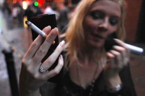
There are some amazing photographs of smokers knocking about (I can think of my colleague Caroline Edge’s photograph of the pregnant smoker as an example) but mine lack artistic merit, especially indoors or at night. Instead I hope the vivid colours and harsh light will give a brash reality to my photographs. These pictures are not about seduction.

I noticed in my research how some photographers, if not all, had produced smoke-related photographs of beauty. To me, this was done for no other reason than juxtaposition; showing something so dirty as a cigarette as a thing of beauty. I can see why they did, photographs work best if they show a contrast, even more so if it includes irony. But do they mean anything beyond their basic cleverness? Not really. Not in my opinion anyway.

Some people look stupid in my photographs. Is that my fault? It’s not deliberate – but these pictures just happen to be the best photographs.

I also worry about too much posing. Ask a drunk person if you can take his photograph and all of a sudden his 15 friends appear for the group shop you didn’t want. But this is what happens. I think these pictures will say as much about alcohol as they do about smoking.

I’ve also seen more mooning men’s arses than I would care to. Why do some people understand ‘take your photograph’ as ‘drop trousers and pull a moony’? And it’s never the women either.

My only regret is that I didn’t take more ‘Before’ photographs, before the ban came in on July 1. I’ve probably got 10 times more ‘After’ snaps now, and I’m still not finished. My main area left to document is workers on their breaks – or should that be workers reluctant to have their photograph taken on their breaks.

I have used my 60mm macro lens and ringflash only sparingly, preferring close-ups with a conventional flash and wide-angle lens. It just takes too long to change when your picture can just walk away. I’ve also been less than impressed with my Nikon wide-angle lens compared to my (broken) Sigma wide-angle, but more on that later.

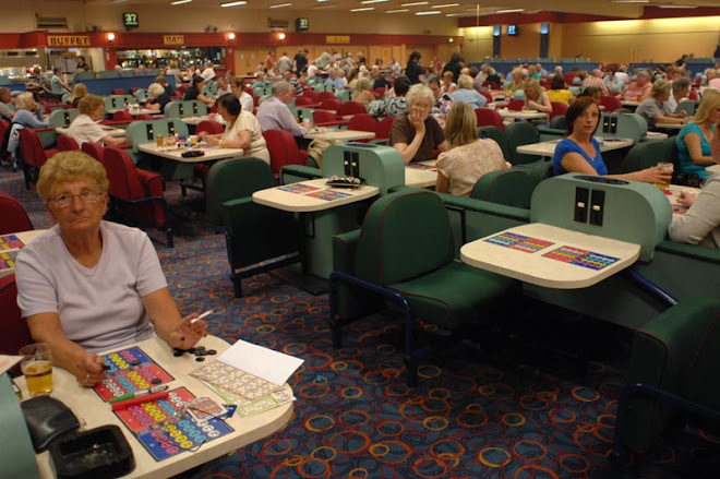
Some of my early shots indoors were very experimental, often using a 150mm macro lens. I love the quality of these pictures but they give such a tight crop that the context of the room, be it a bingo hall or a pub, is lost. While I will use tight detail shots, they are more for variation – not what the nitty-gritty of the project is all about.

Wednesday, August 29, 2007

Term 3


The start to Term 3 came as a bit of a shock, coming just seven days after the end of Term 2.

This was done to allow us students the entire summer to carry out our project until we begin checking in at Chadwick in mid-September. But in reality it meant another double presentation just a week after the last one.

Throw in a deadline for the 3,000 word essay and you've got a pretty cramped schedule. Toploading I think the Yanks call it. Either way, it was busy.

Still, moaning is for losers and it was just a case of getting on with it. I was quite surprised at how many people did actually turn up, thought there would be more duckers who failed to prepare properly.

Well, to be totally honest, some of the presentations were limited to say the least. Each presentation had to consist of your book project (carrying on either your travel or social issues project from Term 2) and your essay proposal. A few of the students went light on the essay part of the presentation. Mine was not brilliant.

Still, I got the message across. For my essay I'm pursuing the Before and After theme, with the hypothesis that Before and After photography is manipulative and only exists as a sales technique. It's a topic I'll have to shrink before I actually write the 5,000 word essay.

My book project will, of course, be Smoking In Public, for which I have trawled the towns and cities of Manchester, Liverpool, Preston and Blackpool.

Sunday, July 22, 2007

Term 2


And we thought things would get easier from now on. No more Thursday night meetings. No more quick deadlines.

Term 2 of this Photo MA was not quite what I’d been expecting. Without the single picture assignments – and effectively just two 10-image projects to carry out – it seemed like there was all the time in the world to do it.

Having just completed Term 2, I can tell you that it’s been fast and furious.

The mission was to complete devise and present both a social issues and travel project, complete them and then present the finished work to our fellow students.

For the record, my chosen projects were Smoking in Public (centred around the time of England’s July 1 ban) and Photograph a European City on a £200 Budget. Self-explanatory really.

My fellow students came up with a wide and varied list of ideas for their projects. Some, it has to be said, were so wide or vaguely varied that they were unable to be completed.

To me, that was part of the process. Coming up with and budgeting for a project that sticks within the boundaries achievability is crucial. Or, to put it another way – don’t get carried away with the fairies.

Unless you’ve got prior experience, the budget proposal is tough. It is a theoretical budget, but you are doing it as id you were attempting to get funding from a funding body. So, a project which is essentially costing you very little has to be proposed using fantasy figures of £5,000 or £10,000.

In that respect, my presentation was not the best, but when it came to presenting the finished work I had it in the bag (or in print and on a website as the course demanded). There was more squirming and excusing than I expected from others who had not pulled off their proposal.

This was for various reasons, some out of the students’ hands. Proposals that failed to come to fruition were: a three-week train journey across Siberia, a participatory project of passenger son London buses; a photo-essay on the US Army base at Menwith Hill; and a project by a student whose excuse about it not being done was so long that I fell asleep before he told us what it was. But credit to these people for doing something else and/or turning up.

That said, there were some tough proposals that had been successfully carried out too. The Yorkshire pot ash mine was a good one, also the essay on the civil war in Cyprus, American ghost towns and the women who have breast reconstruction surgery.

But the warning is, kids: Don’t get over ambitious.

Like it says in The Bible – keep it real.

Saturday, May 26, 2007

Assignment 8


ASSIGNMENT 8: You are required to consider what is unique about the images you take within your own community and produce a "sellable" image that is unlikely to have been considered by a visiting photographer from outside your region/country. In attempting this assignment you should engage with the issue of local photographer V visiting photographer and consider the issue of fair trade photography. As part of this you should look at Memat as a means of fair trade distribution of photography and ask the question whether you think this system is a potential solution to allow local photographers to represent their own communities.

Bit of a technical pass, this one. The point I'm making is that prior permission has be obtained to photograph this fine concrete monolith. Hence you can't just turn up and photograph it. Well you can, if you don't get caught.

Obviously I've photographed Preston Bus Station and Car Park before, so I have written permission already.

The other part of this assignment is to make the picture look appealing - sellable. So what I've done, and this is a good trick this, is tilted my camera to an extreme angle and used the sweeping lines to please the eye. Between me, you and the gatepost, this adds impact to an image. Interesting point that, take note.

Friday, May 25, 2007

Assignment 8


ASSIGNMENT 8: You are required to consider what is unique about the images you take within your own community and produce a "sellable" image that is unlikely to have been considered by a visiting photographer from outside your region/country. In attempting this assignment you should engage with the issue of local photographer V visiting photographer and consider the issue of fair trade photography. As part of this you should look at Memat as a means of fair trade distribution of photography and ask the question whether you think this system is a potential solution to allow local photographers to represent their own communities.

Bit of a technical pass, this one. The point I'm making is that prior permission has be obtained to photograph this fine concrete monolith. Hence you can't just turn up and photograph it. Well you can, if you don't get caught.

Obviously I've photographed Preston Bus Station and Car Park before, so I have written permission already.

The other part of this assignment is to make the picture look appealing - sellable. So what I've done, and this is a good trick this, is tilted my camera to an extreme angle and used the sweeping lines to please the eye. Between me, you and the gatepost, this adds impact to an image. Interesting point that, take note.

Saturday, March 31, 2007

Assignment 7


Assignment: Produce a single image on the subject of Cast Away. Your picture should be designed to give a sense of tranquillity and peace away from the hustle of city life. The picture is aimed at Conde Nast Traveller magazine and should be accompanied by a caption that will be understood by a broad international readership.

There was a heated debate in our seminar this week about the type of image required for this assignment and whether a less obvious image would work.

By ‘less obvious’ I mean a photograph which fails to meet the brief, would never be used by a travel magazine editor and which is supposed to make the viewer think deeply about some kind of suggested hidden meaning. Can you guess which side of the fence I was sitting on?

There was a feeling of hysteria in the class as several otherwise normal people decided a magazine is needed that uses abstract imagery to suggest a holiday landscape where the reader must use their brains to think. Suddenly everyone’s a magazine editor.

Thinking of doing this course? Prepare yourself to be smacked around the face by intellectualism.

If such a magazine did exist it wouldn’t sell many copies. It would fold very quickly. That’s the harsh reality. It was a good, polarising discussion though, even if it was poppycock.

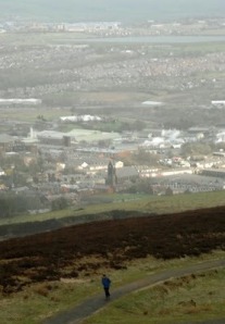
Anyhow, my image for this assignment attempted to show a man escaping city life in a quite literal way. The weather form the top of Sunnyhurst Tower in Darwen, Lancashire, meant that this photograph would never make it on to the pages to Conde Nast Traveller. But neither would Darwen, Lancashire.

Dyer Traits

A bit about Geoff Dyer (and it’s a bit long, so hang on in there).

Geoff Dyer is a kind of theorist. He theorises on photographs. This is my theory on him.

Total boll ocks. Nice fella like, but his ideas were built on pointless theory and scandalous assumption.

He gave a nice lecture. If you like hats. Or jazz. Or white fences. He didn’t take his coat off either. The whole afternoon was strange,

I know it’s difficult to believe that a serious theorist could keep a straight face for an hour as he talked about his analysis of 1920s photography through images with hats in them, but Geoff managed it.

I have to admit I sat there in disbelief for most of the talk. Can you really have an intellectual, photography-based discussion on hats? Evidently, yes.

In my opinion Geoff, who does not take photographs himself, used a great deal of unfounded interpretation of photographs, garnished with a smattering of rhetoric.

It all came to a head when he spoke about one photographer who had taken a picture of a white fence. Geoff claimed the photographer had obviously referenced some previous images of white fences in some cultural tribute. He even wrote in his book.

But the photographer told Geoff this was, in fact, clap trap. He liked the white fence, he took a photo of it.

If ever there was proof needed that over analysis yields pointless theories, this was it. Geoff still writes his books.

He listened a lot in the lecture. So intently was he listening, in fact, that I am convinced we gave him the idea for his next book. ‘If brown is the new black,’ one student asked, ‘what is the new hat?’ Now there’s a Geoff Dyer lecture to miss next year.

Good luck to him, he probably earned more money for that lecture than I take home in a week. And a few of my fellow students stuck up for him. But is he really contributing to the discussion? He is, if you like pointless discussion. Well if the hat fits...

NOTE: The worrying thing is this: I would never have taken a photograph of a white fence but might be tempted to now after Geoff’s lecture. I have been made aware of pointless white fences in photography. My mind has been poisoned. Geoff Dyer has poisoned my mind.

Thursday, March 22, 2007

The nightmare that turned into a bad dream

There are those on this course, not least the lecturers, who are not happy with its organisation.

The Virtual Learning Environment for our photography MA is quite a funky little thing if you ignore all the broken links. You get all your assignment information, reading guides and timetables in one place, plus all the news from the students studying in China. And that’s part of the problem.

The course is run by a British man called Dave Clarke who lives in Dalian where the course is run simultaneously with Bolton’s. Why is that? Well, I’ve only heard in whispers that it’s because Clark likes living there. Other than that, there’s no reason for the link.

Problem is there has been several communication problems. This culminated in a rather heated debate in Bolton’s main lecture theatre on the Chadwick Campus last Thursday (March 15) because our most recent assignment, number 7, was totally cocked-up. There were two different tasks (see assignment 7 notes).

It has become increasingly obvious over recent weeks that both Ian Beesley and his assistant Terry Speake are very disillusioned with the management issues between here and Dalian.

They have tried to hide it from us, Ian even advising some students against emailing Clarke directly, but when half the seminar is spent ironing out confusion over course direction, frustrations come to the fore.

One of the students even revealed he had considered turning down the invitation to join the course because of the feedback he got from other academics within the industry. ‘It’s getting better,’ said Ian, ‘last year was a nightmare, now it’s just a bad dream.’

Personally I couldn’t give a toss what problems they’re having between here and China. There are a few little problems but the course is run well in Bolton, perhaps it should be run entirely from Bolton. However, if the students in Bolton is being told or emailed one thing, while the VLE postings say something entirely different it is not good. The students carry out the wrong assignments, the lectures look clueless.

I feel Ian is desperate not to antagonise Clarke, but how long he will diplomatically put up with these kinds of problems as a self-confessed tell-it-like-it-is man I don’t know.

Should I be writing this now? Well, as a firm believer that blogs are nothing more than never read diaries, I don’t think it’ll make any difference.

Nobody knows about this bog on my course. It is written as a diary which could possibly be read by a prospective student on the course. That’s the only value I see in it; showing what goes on. It could give them something to talk about when they meet Ian for their application interview. One thing I will say is I’m loving the course, I’m sure others will too.

If Dave Clarke should read this, I don’t think he’ll have too much cause for complaint.* I’m sure he’s aware of the complaints already. We’ll see if I get pulled up about it.

If I do I’ll say: ‘Freedom of speech, tell it like it is’. Much like Ian Beesley.

*If you do complain, please me reference using the Harvard citation system.

Wednesday, March 21, 2007

The nightmare that turned into a bad dream

There are those on this course, not least the lecturers, who are not happy with its organisation.

The Virtual Learning Environment for our photography MA is quite a funky little thing if you ignore all the broken links. You get all your assignment information, reading guides and timetables in one place, plus all the news from the students studying in China. And that’s part of the problem.

The course is run by a British man called Dave Clarke who lives in Dalian where the course is run simultaneously with Bolton’s. Why is that? Well, I’ve only heard in whispers that it’s because Clark likes living there. Other than that, there’s no reason for the link.

Problem is there has been several communication problems. This culminated in a rather heated debate in Bolton’s main lecture theatre on the Chadwick Campus last Thursday (March 15) because our most recent assignment, number 7, was totally cocked-up. There were two different tasks (see assignment 7 notes).

It has become increasingly obvious over recent weeks that both Ian Beesley and his assistant Terry Speake are very disillusioned with the management issues between here and Dalian.

They have tried to hide it from us, Ian even advising some students against emailing Clarke directly, but when half the seminar is spent ironing out confusion over course direction, frustrations come to the fore.

One of the students even revealed he had considered turning down the invitation to join the course because of the feedback he got from other academics within the industry. ‘It’s getting better,’ said Ian, ‘last year was a nightmare, now it’s just a bad dream.’

Personally I couldn’t give a toss what problems they’re having between here and China. There are a few little problems but the course is run well in Bolton, perhaps it should be run entirely from Bolton. However, if the students in Bolton is being told or emailed one thing, while the VLE postings say something entirely different it is not good. The students carry out the wrong assignments, the lectures look clueless.

I feel Ian is desperate not to antagonise Clarke, but how long he will diplomatically put up with these kinds of problems as a self-confessed tell-it-like-it-is man I don’t know.

Should I be writing this now? Well, as a firm believer that blogs are nothing more than never read diaries, I don’t think it’ll make any difference.

Nobody knows about this bog on my course. It is written as a diary which could possibly be read by a prospective student on the course. That’s the only value I see in it; showing what goes on. It could give them something to talk about when they meet Ian for their application interview. One thing I will say is I’m loving the course, I’m sure others will too.

If Dave Clarke should read this, I don’t think he’ll have too much cause for complaint.* I’m sure he’s aware of the complaints already. We’ll see if I get pulled up about it.

If I do I’ll say: ‘Freedom of speech, tell it like it is’. Much like Ian Beesley.

*If you do complain, please me reference using the Harvard citation system.

Week 6 assignment


We had the choice of two assignments this week, though that wasn’t the plan of the lectures (more of that later). While the actual assignment was the same (below) the outline brief was totally different on email from the one on the VLE.

Assignment: Produce a single image that documents the changing culture of your community for National Geographic magazine. Study the motivations for the National Geographic All roads project at www.nationalgeographic.com/allroads/photography.html and the wealth of information on National Geographic photography at www.nationalgeographic.com/photography/. This should inform your composition and caption

It took a while for the penny to drop with this assignment, especially when I was reading the first brief. I couldn’t think how I could apply changing culture to my locality (Preston in Lancashire). What I came up with is more of a national culture, though I did attempt to excuse the picture with the caption explaining the kebab shop was part or the city’s student area, a huge boom for the area over the last five years.

I quite like the image though it is not bold and bright enough for National Geographic magazine, for which I am proud to say I am a subscriber. This information is not needed, but it all helps to paint a picture of myself.

I digress, the idea of taking a photograph in a kebab shop only came to me on the Tuesday (our deadline is 4pm, Thursday) so I had two nights to get my picture. Both nights I was at work until around 11pm, so it was straight into Preston from Fulwood.

Unfortunately, Tuesday and Wednesday nights are not very busy in Preston. This is not the kebab shop I wanted to photograph but was the only one to have customers in it. I was using my preferred wide-angled lens. This is a subject I would happily return to in more depth, even with the risk of having my camera smashed or stolen

Tuesday, March 20, 2007

Very Little Elp

A major part of the course is the comments we make on other people’s pictures every week.

We were told at the outset not to criticise photographs on technical issues and not to get into a comment spat – commenting on comments.

It took a while for me to get my head around the technical issues. It is very difficult to comment on a photograph without mentioning technicalities. I think I got there in the end.

As for commenting on comments, apparently there was a physical punch up in class last year between two students who had disliked or disagreed with each others comments.

It’s easy to see how. I noticed early on how one or two people were leaving comments above what I would call the acceptable level or criticism. Two students in particular have been quite rude on other people’s photographs.

Now I’m not easily offended or over-sensitive, but some of the comments I have read have left me stunned. One guy accused people of being subconsciously prejudice because they criticised his migrant workers photograph. Other examples include:

The picture of three young Asian girls working in Britain, one comment read: ‘they look a little tarty. The one on the left is coyly massaging the tree trunk; the middle one looks like a juvenile delinquent; and the last one has a distinctly post-coital gaze.’

To be fair to this comment maker (above) it was the first week and she has not made similar comments since. Others however (below) have persistently gone for the jugular.

Of a picture of an old photo, ‘There is little I can say because it doesn't really meet the brief… You haven't even done the IPTC data properly. I think it is personally interesting for you, but as for the other MA students I don't think there is much we can learn from this photograph. By sticking more closely to the brief we can all help each other consolidate our knowledge through the appraisals we do each week. Otherwise you are just wasting our time as well as your own.’

Of his own picture of a somewhat bland skyline: ‘Some useful additional comments (thanks for these) that steered me to thoughts I hadn't considered at the time. Equally, a couple of rather dull and pointless comments, simply regurgitating what I've already said; their loss of opportunity to practise their analytical skills.’

That’s gratitude for you.

We have to leave several comments each week on eight different assignments. When it was pointed out to Ian Beesley and Terry Speake that some students had over-stepped the line it was obvious that the pair of them hadn’t read any comments. Ian said that the comments, which are to form an assessed journal I our first term, would be looked at after the eight weeks. If a student had over-stepped the line, he would be spoken to.

That’s a bit late as far as I’m concerned. We should be getting guidance after week one and week two to make sure that we’re on the right track. Telling us we’ve got it wrong after it’s all done is a bit negligent on their behalf.

I can only pray that I’m around when this year’s punch-up takes place.

Week 5 assignment


Assignment: The assignment this week requires you to produce a single image that represents fragile earth. The image is requested by a client of Panos Pictures for a magazine feature on the global environment. The article is designed to put pressure on all countries to re-evaluate their environmental policies in a move to improve the world in which we live. Panos pictures has gained a strong reputation for tackling social issues around the world through strongly aestheticised images. The composition and quality of your images are important to the success of this assignment so make sure you spend time looking through some of the Panos photographers featured on their website.

I used the parents one week, now I’ve used the kid. But the trump card was the fisheye lens.

One of the things I’ve found tough on this course is the depth of analysis. Maybe I’m to shallow – or too thick - but I can’t stand the critical evaluation. It often goes to a level which is far beyond what a picture deserves. It gets to a point where the analysis is effectively made-up or assumed, in my opinion.

When it comes to dreaming up picture ideas I am much more one-dimensional, more literal.

So. fragile becomes a rounded horizon courtesy of my fisheye lens and a earth is an isolated baby, seen here at Formby Point near Southport. The fact that Teddy was crying was a bonus.

What you can’t see here is me trying to keep the dogs out of the frame with one hand while trying to take the photograph with the other. The dogs, of course, are a trump card I’ve yet to play.

Week 4 assignment


Assignment: This week you are not required to take a picture but rather train someone else in basic photography to complete the assignment for you. The brief is simply to provide "a unique insight" through participatory photography. Try and find someone who can tell a story from a different angle. For example a child's first day at cub scouts, a policeman on a drugs raid, a homeless man surviving a night of rain, the list is endless. Please remember you are not being assessed on the final image but your analysis of the process and a deconstruction of the image.

Time to rope in the parents for this one. I worried if it is was a bit of a cop-out getting mam and dad involved.

But I thought the idea I had was a valid one, the pictures I asked my mam to take were of my dad in situations that I have not really photographed. It felt right. I decided to go with it. My dad works in his double garage at home building what they call control panels, complicated push-button metal boxes which drive heavy machinery.

I told my mam what to do, she did it. It’s easy this participatory photography. The pictures – and this one in particular – were exactly what I wanted. As I might have said before I had previously thought of this type of photography as not worth consideration. But I see value I it now after the input of our course leader Ian Beesley.

Monday, March 19, 2007

Down The Essay Way

It's been a difficult few weeks on this MA course, mostly because of the dreaded essay.

Now, I'm not one to moan and I know every student has their own reason why the essay is so difficult to write, but it was a bit of nightmare.

That's not to say I've finished it - I've only done the draft and it needs some work done yet.

No, my biggest problem was the words, or wordage as it's known in essay writing circles (why use a simple word when an longer, more complex and abstract word will do perfectly well instead?).

This essay - I chose the title 'Reuters' picture editors, photographers or PR's - who is responsible for the photographic manipulation of Adnan Hajj?' - is 2,000. Not a lot. Except that if you're an incredibly highly-skilled journalist used to cutting down copy and getting the point across with as few words as possible.

Quite frankly, I could have got my point across in 200 short words, not these long drawn-out sentences which I regard as total bollocks. You would get the gist of it anyway.

NOTE: My completed essay will not be published on this blog. Copies will be available on request for GBP9.99.

Wednesday, February 07, 2007

Week 3 Assignment


Assignment: "In ten years’ time, more people will be living in cities than ever before in human history. If we want to live in a sustainable and inclusive world, we must commit to promoting the development of sustainable and inclusive cities.." Produce a single image to illustrate Urban poverty in your community to be published in Oxfam publications. Please refer to the example Terms of Reference to get information on how Oxfam works with photography and consult their website for corporate image style. The question of subject dignity and ethical photographic practice should be a major factor in the way you go about this assignment.

This time it’s urban poverty. Not too difficult you would think, not in northern England anyway.

Crucially though with this week’s assignment there was a subtle twist. It had to be a photograph in keeping with those used by Oxfam. Quite a few people on the course missed this.

Oxfam’s images, apart from being sparse in the area of UK poverty (there’s plenty abroad), lack grit and realism. Instead they try and show the positive side of its charitable work with images very pristine, sort of Getty-fied, Americanised, sanitised.

My image was positive (reasonably) but lacked any impact or ‘wow’ factor (but I do think it was Oxfam-friendly).

One other point of note is the comment system we use on the course. We have to caption our pictures, like you would as an agency, then leave an open explanation. Four, five or possibly twelve of our fellow students then leave their own critique of my image in relation to the brief. And I must do a final, concluding comment.

Thing is, some students are captioning their photographs with what I consider lengthy and irrelevant personal information. They are then doing the same with their opening comment.

A lot of the conclusions are also short story-esque, though admittedly they do stick to relevant analysis more than the first comments. The problem for me is that I’d like to have a life outside of this course and having 40-odd monologue style comments to read is too much. There’s just too much waffle.

It’s impossible to read everyone of them, and I think this detracts from the course because students will end up missing the good points which will improve their understanding of photography.

I could take this up with the ultra-friendly Mr Beesley, or I could just get him to read my blog. Problem is, he’d have to wade through too much waffle to get to the point.

This is the point – this particular blog has gone on way to long.

The Problem With Alamy, or It’s Difficult To Fix When You Don’t Know Why It’s Broke

Alamy is the accessible photo agency where professional photographers or enthusiastic semi-pro’s can start earning dosh.

It looks like the perfect site. Easy to register, a seemingly straight-forward image submissions process and a fairly high hit-rate selling their stock.

The site is well designed and purports to be user-friendly, but too may photographers are finding this not to be the case.

In fact, a growing number appear to have given up selling their photos to the agency after falling at the first hurdle - failing to overcome the Quality Control Test.

There are two major problems a contributor faces with his first Alamy submission.

First is the site’s own submission guidelines. At first glance they are well laid out, thorough and descriptive, a step-by-step guide which should eliminate any problems before you start.

There is a lot to read in the commission guidelines, but this is a professional outfit and that’s as it should be. If you can’t be bothered going through the rules, log off.

The problem is the guidelines lack some important details and facts which could simplify the whole process.

Alamy’s own guidelines do not actually make it clear what type of files it accepts, and if Tiff files are acceptable. The process of interpolation – upsizing of file size – is not clearly explained either.

The other nagging annoyance dragging Alamy down is its impersonal dealing with contributors.

It’s automated email system does keep the contributor informed when a QC Test CD has been received. It also informs the contributor what will happen next, and the expected timescale.

But when that email drops stating that every image on your submission has failed the QC Test there is no further explanation as to why.

For an initial or second submission this is fair enough. The potential of a novice contributor to get things wrong is high and I understand Alamy not having the time to give detailed reasons for failure.

But when the contributor is on his fourth or fifth submission of the same 10 images and is convinced he has got everything spot on (like I was) then surely a nudge in the right direction would benefit both parties.

I did at one point get an email from a named sender, which explained my photos were rejected for technical reasons but didn’t tell me what I actually needed to do. I had submitted interpolated Jpegs – sending Tiffs instead was the answer I was not given.

It was only after doing my own research that I conquered the problem.

So, those of you still bamboozled over the Alamy QC test – this is how to pass it.

1. Use a Tiff file.
2. Zoom into your photograph at 100 per cent and slowly check for any dust marks. Clone them out if necessary.
3. Check if your Tiff is 8bit or 16bit.
4. Install the genuine Fractals plug-in into Photoshop CS or CS2. Use this programme to upsize your photograph to 50mb if it is 8bit or 100mb if it is 16bit.
5. If the Tiff is 16bit, change it to 8bit. It should now be around 50mb.
6. Save it. It’s ready for the QC test.
Tuesday, January 30, 2007

Bolton, a strange place to be

You won't see Bolton University's Chadwick Campus in their prospectus.

The spread out complex is very 1960s - very similar to my secondary school in Birtley near Newcastle (that bit’s of interest to Geordies only, and even most of my Geordie readers won’t find it very interesting).

Some of the corridors and classrooms are quite rundown. And there are these bizarre covered walkways which link many of the buildings together. They are
in a style of which simply don't get made anymore.

Never-the-less, the photography school seems fairly well equipped. Though our course leader Ian Beesley paints himself as a technology aloof Yorkshireman, he is able to connect his laptop to the internet and the overhead projector without too many problems.

The online learning database - the VLE - is absolutely packed with support material, links and papers to read. It doesn’t look like they've missed anything out - they seem very aware of everything that is going in the industry.

For a few weeks now I have struggled to get my images accepted onto the Alamy photographic agency because of technical deficiencies. Alamy's own instructions are very ambiguous. I'd go as far to say that it is misleading.

However, a link from the VLE to a BJP article revealed how simple the process actually is. If only Alamy had the article on their own website.

NOTE: There is so much to read for the course on a weekly basis I am s****ing myself over getting it all read.

Wednesday, January 24, 2007

The words get longer (and longer)

If you can’t read, this course isn’t for you. Some of these essays we have to devour are turning my guts inside out.

Take these two concluding sentences from David Campbell's Salgado and the Sahel, an essay on images of famine.

"Photographs are a modality of power, and the bulk of contemporary famine images conform to colonial economies of representation. In contrast to the depoliticization of disasters through such pictures, Salgado's compartment vis-a-vis his subject’s functions as an ethical and responsibilizing practice in which the aesthetic repoliticizes, making it possible to envisage a humanitarian ethos."

Interesting essay, though I'm not really sure what it is it's concluding. Perhaps someone should right on essay on understanding this essay. I feel this is a subject I shall return to.

So there you go, 54 words. I feel I should declare that I am a sub for the Daily Star in my day job. I can confidently say that at least 15 of these words would be substituted before the passage got anywhere near print. Even then it would be far too complex.

Like I said before, the Plain English Group would have a field day.

Monday, January 22, 2007

The first lecture - Getty Images

I quite enjoyed our Thursday afternoon discussion on Getty Images.

I was quite taken aback by course leader Ian Beesley's revelation that he earned between £5,000 and £11,000 a year from his stock photography with his photo agency until Getty bought them out. Since then, he confessed, he's gotten virtually nowt.

He readily admits his type of pictures, his style, doesn't fit in with Getty. What I don't understand is that he's not attempted to transfer to another agency more suited to selling his work.

I take the point that he can say to clients 'I am a Getty photographer' and trading on the name can give him influence in getting work

But If there's one thing I've learned as freelancer it's that you can't be snobbish in the work you accept or turn down. It all counts and I'd rather have a chunky cheque drop through my letterbox every year instead of telling people I'm a Getty man.

I think one or two of the other students agreed with me. I'm sure we'll ambush Ian on this in the future.

Week 1 Assignment


Assignment: Produce a single image of a national news event to be posted on Getty Images. We suggest you check the newspapers, TV news and web to see what is happening or find a newsworthy issue to illustrate. Images should be captioned using the Getty IPTC Guidelines.

I found the picture assignment details a little confusing, in that I was not totally sure what kind of picture was wanted.

Did they want a picture that could be used by Getty again and again? Or was it a picture that Getty could sell specifically to a newspaper. I chose the latter.

My picture of Starbucks was inspired by a news story which featured a picture from Starbucks. Easy.

In the discussion the emphasis was on picture re-saleability, though this would seem to put the picture in Getty's creative section rather than its news area.

I’m convinced I got a newsworthy (if slightly arty) picture, but our lecture was more about producing pictures with high repeat sale potential. Is that the lesson we were supposed to learn? Picture agencies are less about the story and more about the money.

The first two days

Twenty-ish people on the course, plus another group simultaneously studying in Dalian, China.

If there's one thing I've learned pretty fast about this course it's that there are some long words ahead.

I read Dave Clarke's essay on global photography markets. It was very long.

There has obviously been a lot of work put into it. He's travelled to Bangladesh, Ethiopia and written a comprehensive document.

The only problem, he's carried on using the same jargon as some of the reports he's used as references. So, what you get is constant references to the 'majority world', then a stream of long words wrapped in longer sentences. Not exactly bed-time reading, I can tell you.

If the Plain English Campaign got hold of Mr Clarke, he’d never get out alive.

Reading this essay and others we have handed, I find myself constantly referring to the internet to discover the meaning of words and phrases. I'm still not sure what 'majority world' actually means. I'm sure I'll work it out as I go along.

Friday, January 12, 2007

Test Assignment - Global Warming


This photo was our first single picture assignment. The assignment was to take a photograph on global warming, though in reality it was more of a test of or technical skills in uploading pictures on the Photography MA's VLE systems (that stands for Virtual Learning something or other).

As you can see, this was a fairly literal interpretation of the assignment. Did the job though.

A bit Martin Parr said Ian Beesley, a bit pleased I was at that (though I didn't let on).