Showing posts with label flashes to ashes book design smoking ban pdf jpeg lulu.com lulu. Show all posts

Wednesday, March 21, 2012

Talking about smoking photographs at Redeye's Hothouse

[gallery]
Redeye, if you didn't know, is one of the UK's leading photography organisations - or networks as it likes to say.

It's a national outfit but it just happens to be based in Manchester.

For the last two years I was lucky enough to work under one of its larger projects, Lightbox. For this project I attended a week-long photography seminar and exhibited Women and Alcohol at Look2011: Liverpool International Photography Festival. Women and Alcohol also made its way to London for the Photomonth 2011: East London Photography festival.

And in March 2012 I presented my 2007 project, Flashes to Ashes, at Hothouse.

The event was a series of projects talks by photographers from various disciplines. There was a lot of people in the audience. They asked me a lot of questions about smoking.

Hothouse_garry_cook
This work will be exhibited properly for the first time this summer to coincide with the fifth anniversary of the ban on smoking in public places in England.

Monday, December 24, 2007

Flashes to Ashes - book design


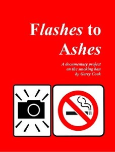
Smoking is brash, dirty and fast. And so is my book. I went A4-ish portrait size to make the most of my portraits (at full bleed). I used only one photograph per page (sometimes one photograph with no picture on the opposite page). And I used a bright red cover with a no smoking and a camera symbol to echo the book's title Flashes to Ashes.

A photo book can be a beautiful object, and indeed there were some beautiful, huge books produced by some of the students on my course. You can sit down with a treasured book and slowly take in every photograph and read every piece of text. But this is not what my documentary subject matter was about.

The photographs themselves were fast, mostly with flash and in-our-face. That's how I've tried to design the book too.

I see this book as something you would flick through and toss away, so the text is minimal. In fact, I've done everything I can to make it a fast flick The photo captions are very brief and, on some pages, I have used a huge headline-style font to tell the story and help push the viewer to turn the page as fast as possible.

It makes for a quick, flowing book. But I do believe the viewer will look at every photograph, which is not true if your book has hundreds of photos crammed onto loads of pages.

I think I might even re-print it on a smaller scale on comic boo paper. It's lighter and more trashy, like a cigarette.